 |
|
| GERSH •
LOS ANGELES bhalperin@gersh.com DENCH ARNOLD • LONDON mac@dencharnold.com |
|
| O-1 US Work Visa + Union, Fluent in French + Dutch |
| FILM + TV DRAMA |
|
CINEMATOG BLOG | |||
| COMMERCIALS | |||||
| CINEMATOG BLOG | |||||
| TRAVELS WITH MY CAMERA | |||||
| CONTACT | |||||
|
The Influence of Edward Hopper on “Quirke”. Written for BSC talk 2015. |
 “Quirke”
was the winner of BSC Best Cinematography Award 2014 “Quirke”
was the winner of BSC Best Cinematography Award 2014With Edward Hopper, it would seem that what is hidden in darkness is as important as that which is visible. Light and shadow do more than just create mood – they harbour and reveal the thoughts and emotions of the characters in the picture/frame. I have always admired how Hopper did this, by being cinematic rather than theatrical. Often, you sense that there is a story ‘off the canvas’, that leads you to imagine the personal world before and after the scene depicted. For Hopper, darkness and shadows in a frame is key to revealing an inner world. Drawn from the novels by John Banville, “Quirke” was a modern noir, adapted for the screen by Andrew Davis and Conor McPhearson. Set in Dublin in the 1950’s in a smokey, musty underworld dominated by theocracy, Gabriel Byrne played Dr Quirke, a man troubled by his inner demons, battling with alcoholism and the shame and self loathing that accompany it. Directed by John Alexander and Produced by Lisa Osborne, we shot in Dublin in the fall of 2013. I am interested in lighting emotionally, rather than logically, and this project was one where I could really use the influence of Hopper to do that. I think that historical drama is often over lit (the Downtown school for instance), but I had to balance the complaints at the time, of BBC period shows being too dark. Hopper is technically no great painter – his paint strokes are languishing at best, but as a draughtsman he is superb. He creates great drama and depth out of the exaggerated linear perspective. Diverging and converging lines set a tension as well as illusion. It is satisfying, pleasing to the eye and when juxtaposed with his figures can set a sense of isolation that subtly shifts a benign everyday scene. It places us in the front seat of the experience and is one of the reasons why his influence translates so well to film. We tried to emulate this, with very careful choice of lens and placement of the camera – picking locations that had a depth or an awkwardness to them and really working at the frames. With Director John Alexander, we found a style that would often cut back to a wider Hopperesque shot – mid-scene. We tried in these wider shots to surrounded the characters with the mood of the scene. In contrast, we would use intense macro close-ups, fragmenting the emotional beats, such as a shaking hand or a turned eye.  Gabriel
Byrne was a quiet and unassuming man, focused and concentrated on
set – almost shy at times. Operating the camera, myself, I had
an intimate relationship with him. He totally understood what we were
trying to do and he would inevitably turn and catch the light in his
eye for me…a DP’s best friend! What was not lit in Gabriel’s
face was often the most revealing. Gabriel
Byrne was a quiet and unassuming man, focused and concentrated on
set – almost shy at times. Operating the camera, myself, I had
an intimate relationship with him. He totally understood what we were
trying to do and he would inevitably turn and catch the light in his
eye for me…a DP’s best friend! What was not lit in Gabriel’s
face was often the most revealing.There is a scene where he sits at a bar, on his own getting progressively more drunk and morose. One of the strongest shots is framed from behind – a hunched and older man, overpowered and beaten. This remains one of my favorite images in the film. It is as if, he is too ashamed to reveal himself. 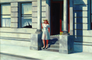 Hopper
often seems to find a stillness in motion and geometry in light. For
instance, in “Summertime” – a figure in strong sunlight,
hiding from the light, as if he is saying ‘look how the natural
light forms this scene’. Hopper
often seems to find a stillness in motion and geometry in light. For
instance, in “Summertime” – a figure in strong sunlight,
hiding from the light, as if he is saying ‘look how the natural
light forms this scene’.People are caught in a decisive moment – but so often it is the ordinary – a run of the mill situation, nothing flashy…it invites us to read in another depth. I come from documentaries – where you are forced to use the natural light around you with no control – but equally want to imbue the image with relevance. With Hopper, there is no flourish, he paints it directly, almost briskly…I wondered whether there is a translation of this, in shooting such a Hopperesque style handheld? And so we shot 80% handheld – composed images, with a slightly rougher edge, that somehow help to reveal the uncertainties of the characters. Saul Leiter influenced us as well, with his verite New York moments – you sense he drew inspiration from the great man too. 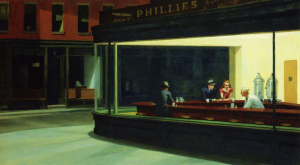 Hopper
was not afraid to use colour – his palette is often one of muted
tones but strong contrast. For instance, he painted the ‘Quai
des Grands Augustins’, many times, which lay at the end of my
road in Paris – I know it very well. However he distorts it,
exaggerates the perspective and creates a sense of a world beyond
the immediate. The characters in the foreground are the only ones
to introduce strong colour by way of their clothes. It is as if their
choice informs the story of the scene. Hopper
was not afraid to use colour – his palette is often one of muted
tones but strong contrast. For instance, he painted the ‘Quai
des Grands Augustins’, many times, which lay at the end of my
road in Paris – I know it very well. However he distorts it,
exaggerates the perspective and creates a sense of a world beyond
the immediate. The characters in the foreground are the only ones
to introduce strong colour by way of their clothes. It is as if their
choice informs the story of the scene.I tended to desaturate the image, starting from the colours of a dark 50’s Dublin and encouraging the colour to come in the costumes. My feeling is that if you leave colour to the costumes, it becomes more of a choice of the character – and possibly more revealing of that character. (The wonderful Lorna Marie Mugan did the costumes for “Quirke”.) I shot on Cooke S4’s. I roughly netted the back of the lenses, laddering the Christian Dior stockings so that they were not even or uniform. This seemed to help to give a softer look and worked well with the harder Alexa digital sensor. I did not want it to be perfect – as Hopper’s canvasses are often naturally flawed, revealing the painters hand. I then added another light layer of diffusion in front of the lens with a classic soft FX’s filter. If you do this, much of the lens’s ‘bite’ is diminished, so there has to be contrast in the lighting.  Frequently,
Hopper places his characters by windows or doors, (“Automat”
is one of my favourites). There is lots of headroom and the space
around the characters is twice that of the actual scene. Frequently,
Hopper places his characters by windows or doors, (“Automat”
is one of my favourites). There is lots of headroom and the space
around the characters is twice that of the actual scene.Often the inside will be lighter than the darker exterior (I.E. “Nighthawk”). Contrast is essential to his imagery. We tried to keep questioning the choice of frame and if we needed to tell the story in a closer or mid shot, find the space for such a wider Hopperesque moment. by Tony Miller |
||||
| IMDB Wikipedia Facebook Twitter | TONY
MILLER © 2024 |
||||